BigFly Bats / Academic project
A simple mark. A broader identity.
Academic identity concept · Mark development, typography, color & brand applications

The assignment
Brand identity & visual system
The brief
Develop a baseball-bat identity with a recognizable mark and a consistent visual language across different formats.
My contribution
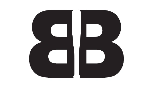
I explored letterforms and baseball imagery through sketches and digital studies, then developed a B-shaped mark around a diagonal bat. I extended that angle into the supporting graphics, paired the mark with a wordmark, and worked through color, layout and application variations.
The deliverable
An identity system with horizontal and stacked signatures, a navy-and-gray palette, supporting patterns and application studies. This is a student concept, not a commissioned or launched brand.
01 / Development
Find the mark in the letterform.
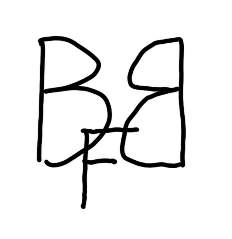
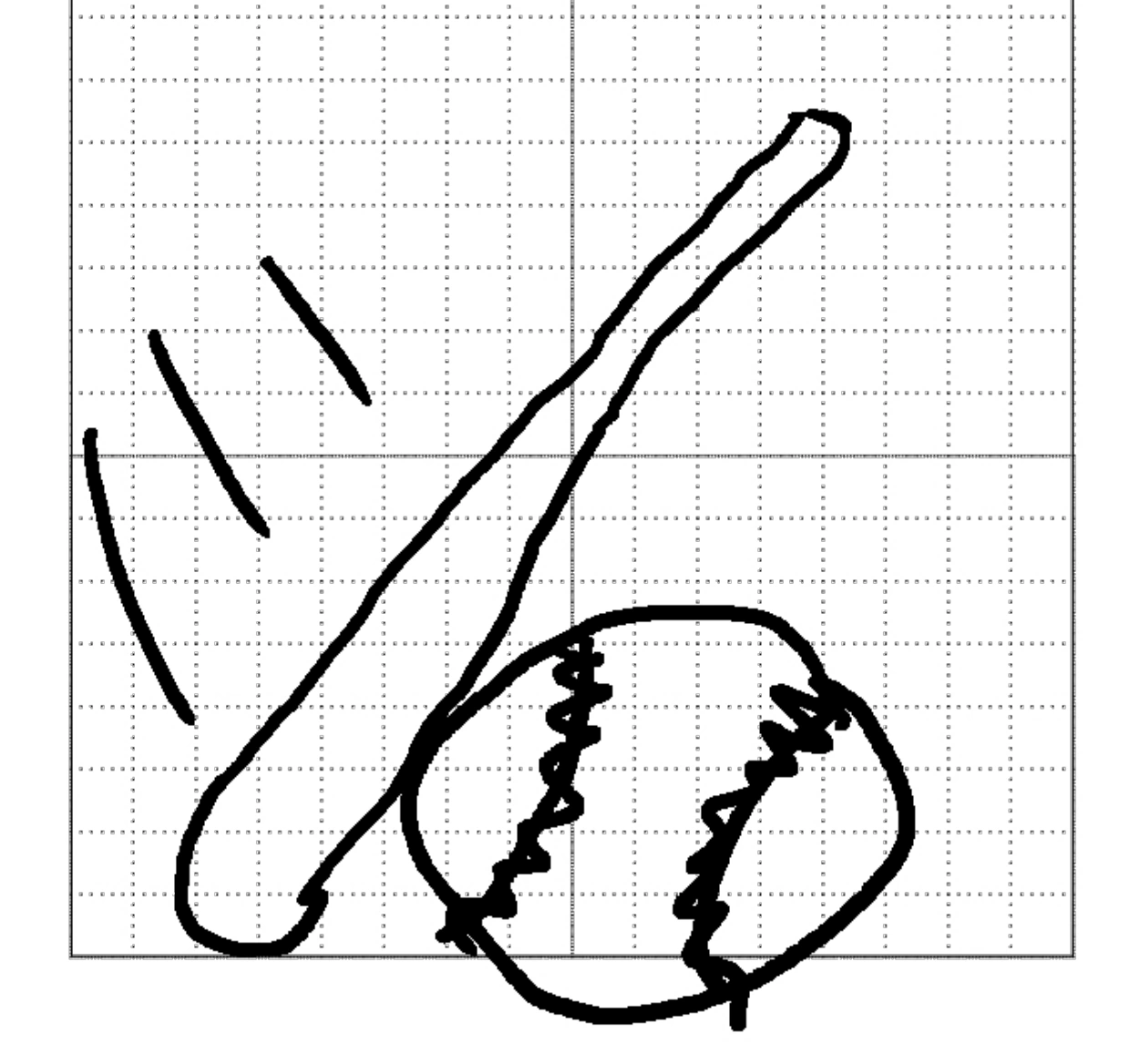
Sketches and digital studies explored the relationship between the initial, the bat and the ball. The selected direction reduces those ideas to one compact silhouette.


02 / Identity system
One idea, several signatures.
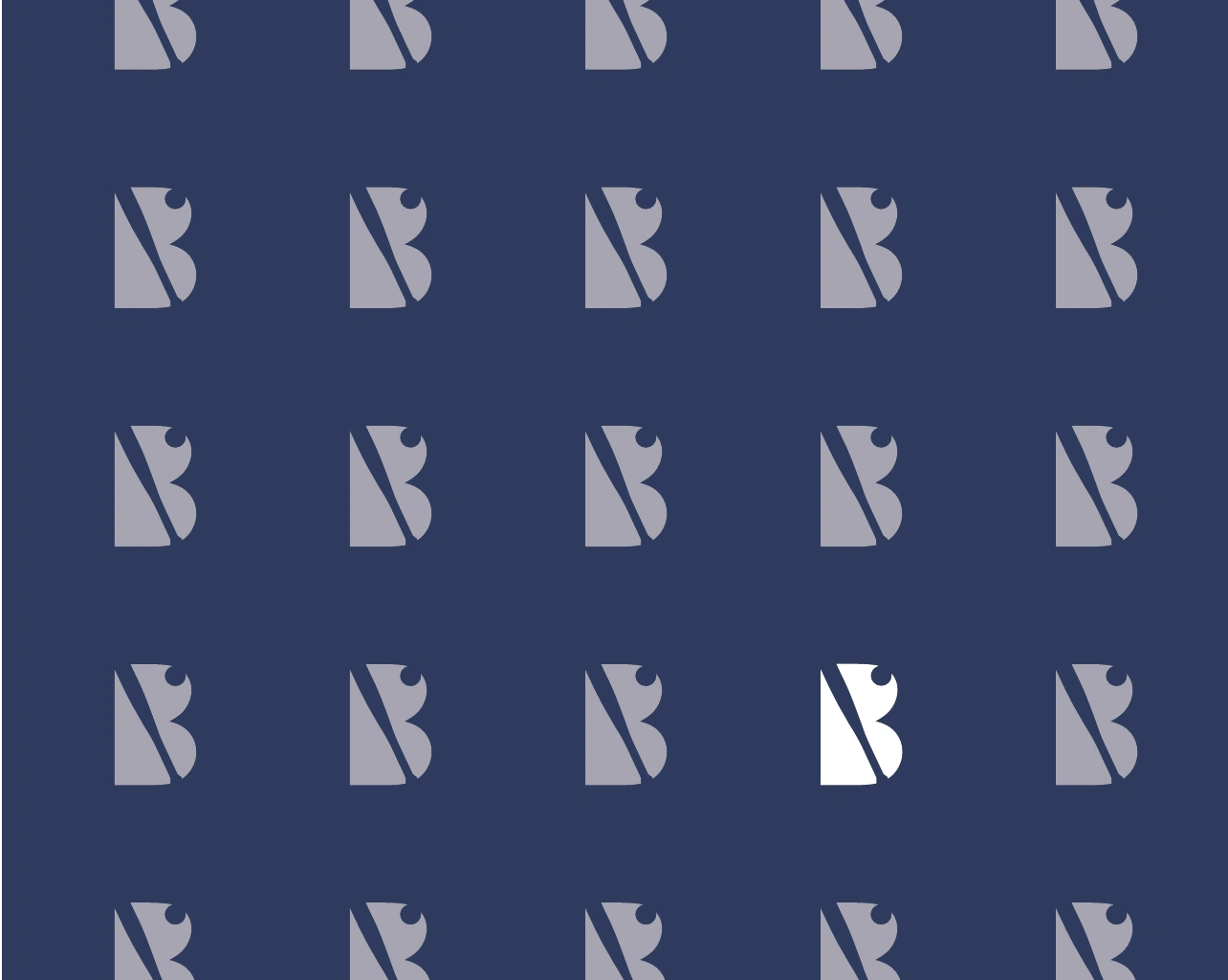
The diagonal bat gives the B its distinctive shape. Horizontal and stacked signatures give the identity room to work in both wide and compact layouts.



03 / Application
Carry the direction beyond the logo.
The supporting graphics extend the angle of the bat into larger shapes and patterns. The sign study shows the identity at an architectural scale.

Academic identity concept. My work includes the mark, visual system and application design. Mockup photography is presentation material; no client commission or real-world rollout is claimed.