Pitman Girls Tennis / Rainbow Lettering
A championship built around the team.
Original championship composition using existing school lettering & mascot artwork
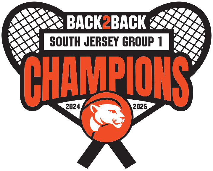 Championship graphic development
 Portfolio mockup
The assignment
Championship graphic development
The brief
A rush championship store needed a new tennis graphic inspired by a supplied visual reference, celebrating two consecutive South Jersey Group 1 titles.
My contribution
I clarified the championship wording, years and tennis imagery, then built the composition around the existing Pitman lettering and panther. I also flagged the design complexity against the requested heat-press and embroidery applications.
The deliverable
A custom championship graphic and revised store proof, with screen printing established as the initial decoration direction. The artwork shown is my October design-development version.
Composition details
A clear message. A connected graphic.
The championship message leads, the years support it, and the panther and racquets connect the composition to the team and sport.
BACK2BACK establishes the story. CHAMPIONS carries the strongest emphasis, supported by the division and both years.
The supplied school mascot sits within the tennis imagery. My contribution is the overall championship composition.
October design-development artwork. Later store artwork included another artist’s revisions. The shirt is a new portfolio visualization of this version, not a production photograph.