Trinity Football / Rainbow Lettering
One identity. Different print treatments.
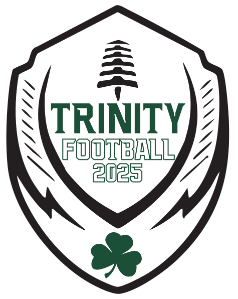
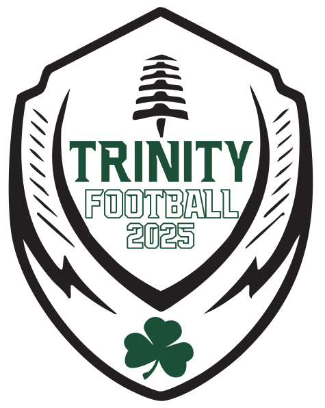
Original redraw & apparel graphic development from rep/customer direction
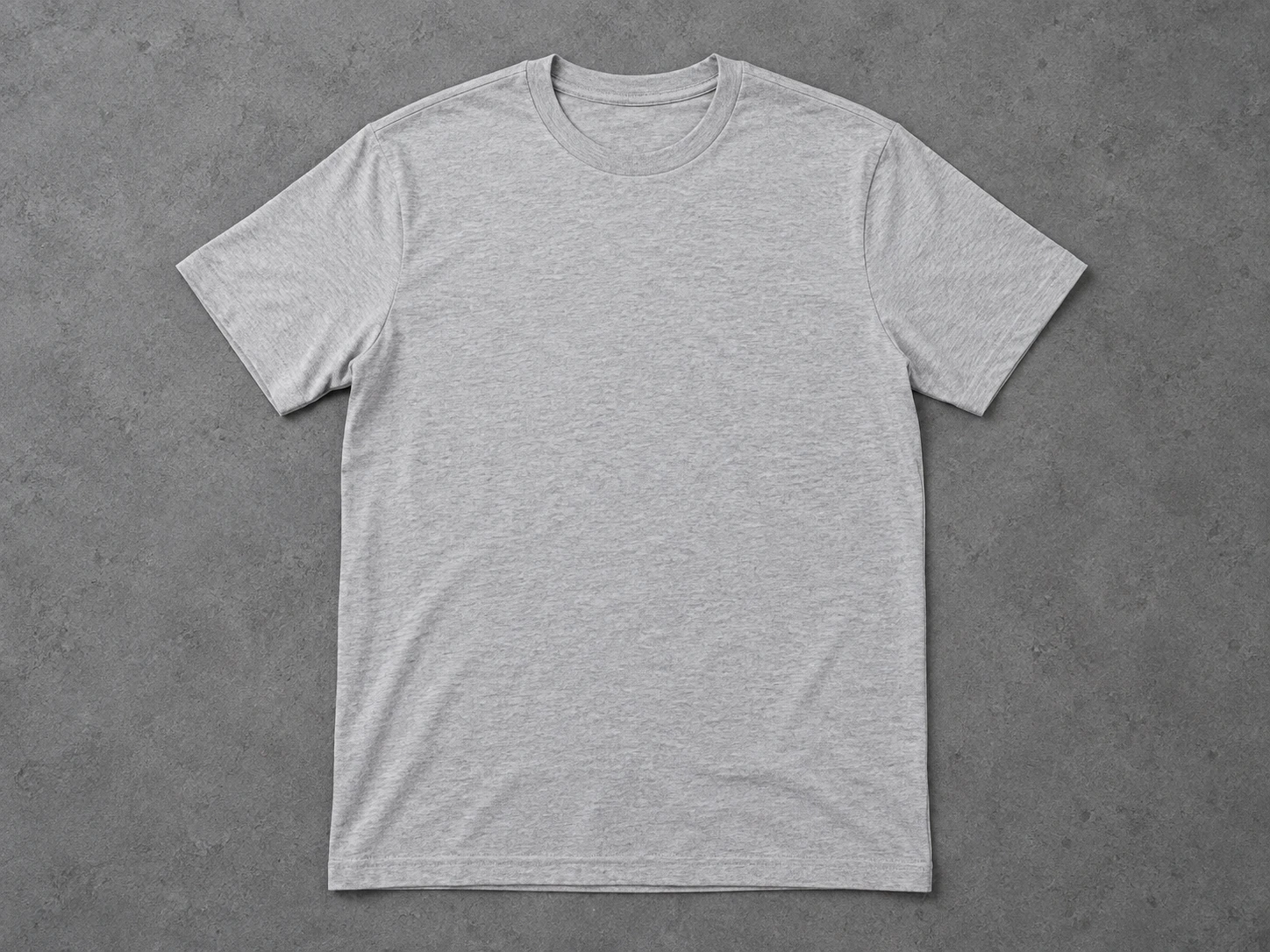
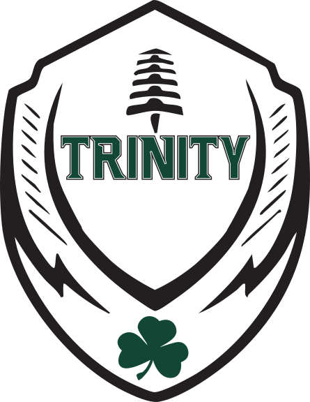 Portfolio mockup
The assignment
Redraw & apparel graphic system
The brief
A rush football store combined changing product requests, an incorrect initial green and graphics that needed a lighter print treatment.
My contribution
I corrected the color direction, refined fills and outlines for print weight and readability, compared screen-print and sublimation treatments, and consolidated feedback into the updated proofs.
The deliverable
A cohesive artwork system adapted across colorways, placements and decoration methods.
Print & colorway decisions
An identity that works across a lineup.
Color, fill and open space affect how the graphic reads on a garment. The production work included reviewing those treatments across the football store.
Three garment backgrounds, checked together.
The full-front screen-print panels from the project proof. These show the artwork on different backgrounds, not a chronological before-and-after.
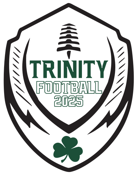
Artwork preparation
Color, coverage and consistency.
I corrected the requested green, refined fills and outlines for print coverage and readability, and carried the revisions into the proofs. The application panels are reproduced from the source artwork; the shirt above is a new portfolio mockup.