UAPB Volleyball / Rainbow Lettering
One team. A coordinated collection.
Client-supplied vectors · Color specification, artwork preparation & proofing
The assignment
Color & production adaptation
The brief
A volleyball collection combined several expressive graphics. The source vectors, written request and brand references did not agree on gray and gold.
My contribution
I compared the conflicting color references, prepared a visual comparison for approval, and organized the graphics into screen-print and embroidery groups with clear placement and color information.
The deliverable
A coordinated artwork and proof package with the color decisions documented for production.
Collection specifications
Different graphics. Explicit instructions.
The artwork arrived as client-supplied vectors. My work connected those graphics to the color, scale and placement information required for the apparel program.
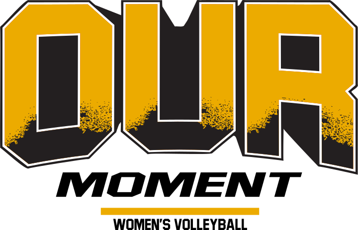
Our Moment
Screen print · Center front
10 × 6.4 in
Black / White / PMS 124 C
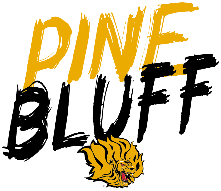
Pine Bluff
Screen print · Center front
10 × 8.6 in
Black / Victory Red / White / PMS 124 C
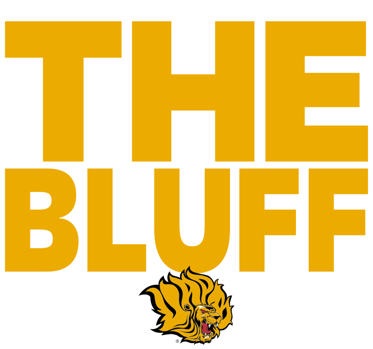
The Bluff
Screen print · Center front
10 × 9.3 in
Color & method
Resolve the reference before release.
I compared conflicting gray and gold references and prepared a color comparison for a decision. The selected volleyball proof lists PMS 124 C for print and 1772 Gold for an embroidery application; ink and thread specifications were handled separately.